Yes—a sunset lamp can change the atmosphere of a bedroom or dorm by putting a coloured wash on a wall. I would treat it as decoration for an evening backdrop, not as the main room light or a reading lamp. It suits a clear wall and a deliberately theatrical look; it is a poor starting point for homework, dressing or judging colours accurately.
I have not physically tested a lamp for this article. I can explain the trade-offs and offer a comparison method, but I cannot verify a particular model’s brightness, colour options or reliability.
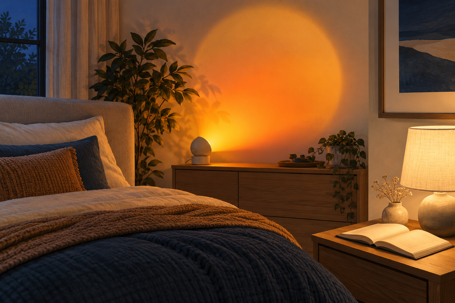
How I would compare it: example conditions, not test results
I would start with a compact bedroom containing a bed, bedside table and an unobstructed wall. I assume a matte, off-white wall, curtains closed, and the ordinary room light switched off for the decorative comparison. I would then repeat the observation with the normal lighting on.
These are example conditions, not a room I measured. I assume no numerical dimensions or exact throw distance. Before comparing lamps, I would record the actual room size, wall finish, background lighting and lens-to-wall distance, and keep them unchanged between products.
My original placement diagram uses relative positions rather than invented measurements:
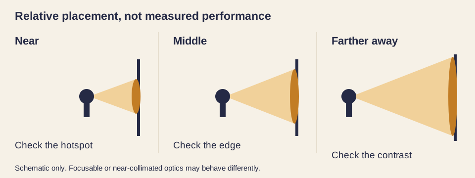
Illustrative geometry, not to scale; prepared October 8, 2026. The spreading-beam example does not describe every lens design.
| Example position | Possible effect with a fixed, spreading beam | What I would inspect |
|---|---|---|
| Near the wall | A smaller, more concentrated patch | Bright centre, visible rings, awkward cropping |
| Middle position | A larger patch using more wall space | Edge shape, furniture shadows, viewing comfort |
| Farther away | A broader wash with less concentrated illumination | Lost contrast when normal lights are on |
Distance and beam geometry affect the footprint; Edmund Optics’ application examples explain the relationship between projection size, optics and throw distance (accessed October 8, 2026). My table applies that principle conditionally. Adjustable focus, lens design and room reflections can change the outcome; verify your actual lamp.
What the “16 colors” claim actually tells me
The “16-color” description comes from the supplied public trend brief, which describes sunset lamps as social-media bedroom decor. It is marketing context, not my verified inventory of a product’s settings. (Source: editorial trend brief, October 8, 2026.)
I would choose amber or orange when I wanted a sunset-like backdrop. That is a visual preference, not evidence that the setting improves relaxation or sleep. Blue, violet or pink may make a dramatic background, but they also tint whatever enters the beam. Warm saturated colours can do that too.
The useful simplified model is a compact emitter or emitter cluster behind a lens, with the optics shaping the patch on the wall. This is not necessarily a literal point source or the same internal design across products. The Department of Energy’s LED Basics explains how compact LEDs enable optical control and how coloured emitters can be mixed (accessed October 8, 2026).
I would inspect the edge for rings, uneven colour, softness and distortion when aimed obliquely. A remote’s colour button cannot tell me whether those features will look appealing on my wall; I would check a demonstration under comparable conditions.
What I would not ask it to do
I would not count a decorative wall patch as proof of enough light on a book. Light reaching the page matters more than how bright the wall looks. DOE’s task-lighting guidance supports directing useful light onto the work area (accessed October 8, 2026).
I also would not judge food, makeup or clothing under a strongly coloured scene. DOE’s LED Color Characteristics explains how a source’s spectrum changes object appearance (accessed October 8, 2026). That supports caution; it does not establish a poor CRI score for every sunset lamp. A saturated colour setting is not a substitute for evaluating a white-light mode’s colour fidelity.
| Decision | Sunset-style accent lamp | Task lamp selected for reading |
|---|---|---|
| Main purpose | A decorative wall effect | Light directed onto the page |
| Useful comparison | Patch shape, colour preference, contrast | Page illumination, glare, shadows, positioning |
| Colour judgement | Coloured scenes intentionally alter appearance | Check the white-light mode’s colour information |
| Room coverage | Do not infer coverage from the projection | Does not automatically replace general room lighting |
This is a use-case comparison, not a product ranking. I have no measured page illumination or colour-rendering data for either lamp.
If I bought one: 3 placement rules
Start with the wall, then adjust distance. I would choose an uncluttered matte surface and move the lamp until the patch fits. I would compare it with normal room lights on before deciding whether the effect is useful.
Keep the bright aperture out of my normal sightline. I would check the view from the pillow, chair and doorway rather than judging placement only while standing beside the lamp.
Keep a separate reading light. I would aim that light at the book and judge comfort there. Planning is not electrical work: permanent wiring, load calculations and code compliance belong to a licensed professional. Follow the product instructions; I cannot assess electrical safety from a decorative photograph.
Limits
I have not measured lumens, lux, CRI, flicker, temperature or durability. Models, optics, settings and wall finishes vary. My diagram and tables explain decisions; they are not lab results, a safety certification or a promise of performance. Verify the exact model and your own room before relying on any effect.
Over to you
Next steps
Read next: