Both are cool-looking whites, but 6000K usually looks bluer beside 5000K. Neither label guarantees more output, better color rendering or safer visibility. Compare two actual products at similar output and beam distribution, then judge them in the space where you will use them.
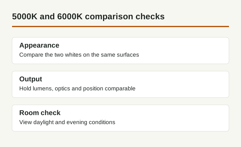
5000K vs 6000K at a glance
| Question | 5000K | 6000K |
|---|---|---|
| Relative appearance | Warmer of these two choices | Cooler of these two choices |
| White and gray surfaces | May appear less blue beside the other sample | Can emphasize a cooler-looking white |
| Brightness | Read lumens and delivered illuminance | Read lumens and delivered illuminance |
| Color fidelity | Check the model’s color-rendering evidence | Check the model’s color-rendering evidence |
| Matching an existing row | Check the existing model and bin if available | Check the existing model and bin if available |
The IES definition of correlated color temperature explains the Kelvin reference. It describes white-light appearance, not a room’s illuminance or a surface temperature. The values in this page’s title are nominal product categories, not measured results for lamps we tested.
Start with the room, not a phone photograph
Put both samples in the intended position, with the same nearby lights running. Look at a white surface, a neutral gray and the materials that matter to the room: timber, upholstery, worktops, paper or merchandise. View them after dark as well as with daylight present. An attractive shop display may not resemble your wall color or viewing position.
In a garage, utility room or desk area, both options can look crisp. Choose 6000K only if its cooler appearance suits your actual surfaces and preference; it does not automatically improve a detailed task. For an evening living area, also compare a lower-CCT option rather than assuming either cool choice is necessary.
A camera adjusts white balance and exposure. A side-by-side photograph can show where the samples were installed, but it is not a reliable color measurement. Judge the physical scene with your eyes; use suitable measured product data where the specification requires it.
Keep output, optics and color quality separate
The ENERGY STAR downlight criteria distinguish CCT, light output, efficacy and color rendering for products in that category. Their scope does not certify every strip or lamp. When comparing other products, request the corresponding model’s data rather than borrowing a downlight criterion as a universal threshold.
Equal power does not establish equal lumens. Equal lumens do not establish equal light on a desk if one product has different optics, mounting height or shielding. Compare the light distribution first, then use the lumens calculator to organize a planning estimate. It cannot replace fixture photometry or a check of installed illuminance.
Color rendering is separate again. A higher Kelvin number does not tell you how reds, skin or fabric colors will appear. Read the CRI guide and request more complete color data when the task depends on subtle color distinctions. Do not compare a low-output, poorly shielded sample with a higher-output fixture and attribute the entire difference to CCT.
Plan matching, controls and replacement
For a continuous visible strip or row of fixtures, choose compatible products with a documented matching policy. Nominal CCT alone does not eliminate tint differences between models or batches. Keep the model number, chosen setting and purchase details for replacement, and ask whether samples and production stock use the same construction.
Ordinary dimming reduces output; it does not necessarily move a 6000K source to 5000K. Tunable-white and dim-to-warm systems are different product types and need matching controls. Check the actual operating range and compatible driver instead of treating a dimmer as a color-temperature selector.
A simple comparison record
| Keep the same | Record what changes |
|---|---|
| Fixture location and viewing position | CCT setting and model |
| Other lights, blinds and room surfaces | Time of day and daylight condition |
| Similar delivered output and beam | Perceived tint, glare and task comfort |
| The task you actually perform | The chosen setting and reason |
Use one record for each room or lighting layer. A sample that works over a pale workbench may not suit a reading chair beside warm lamps. If the room feels harsh, also investigate glare and source visibility rather than changing CCT alone.
Common questions
Is 6000K brighter than 5000K? Not by definition. Check output and distribution for the exact products.
Can the two be mixed? Yes, but adjacent sources can make the difference more obvious. Separate the lighting layers deliberately and check the combined scene.
Which is better? The useful answer comes from the room comparison and the required task. Neither nominal CCT establishes quality, comfort or performance by itself.
Next steps
Color temperature explained · 3000K vs 4000K · Lumens calculator
Questions & discussion
Share a question or a useful experience about this guide. Comments appear immediately. Your name and comment are public. Email is optional and stays private; reply emails are not enabled yet. Comment privacy.